Building NHL Polar Charts
Using a basic visual to get a basic view of playing styles
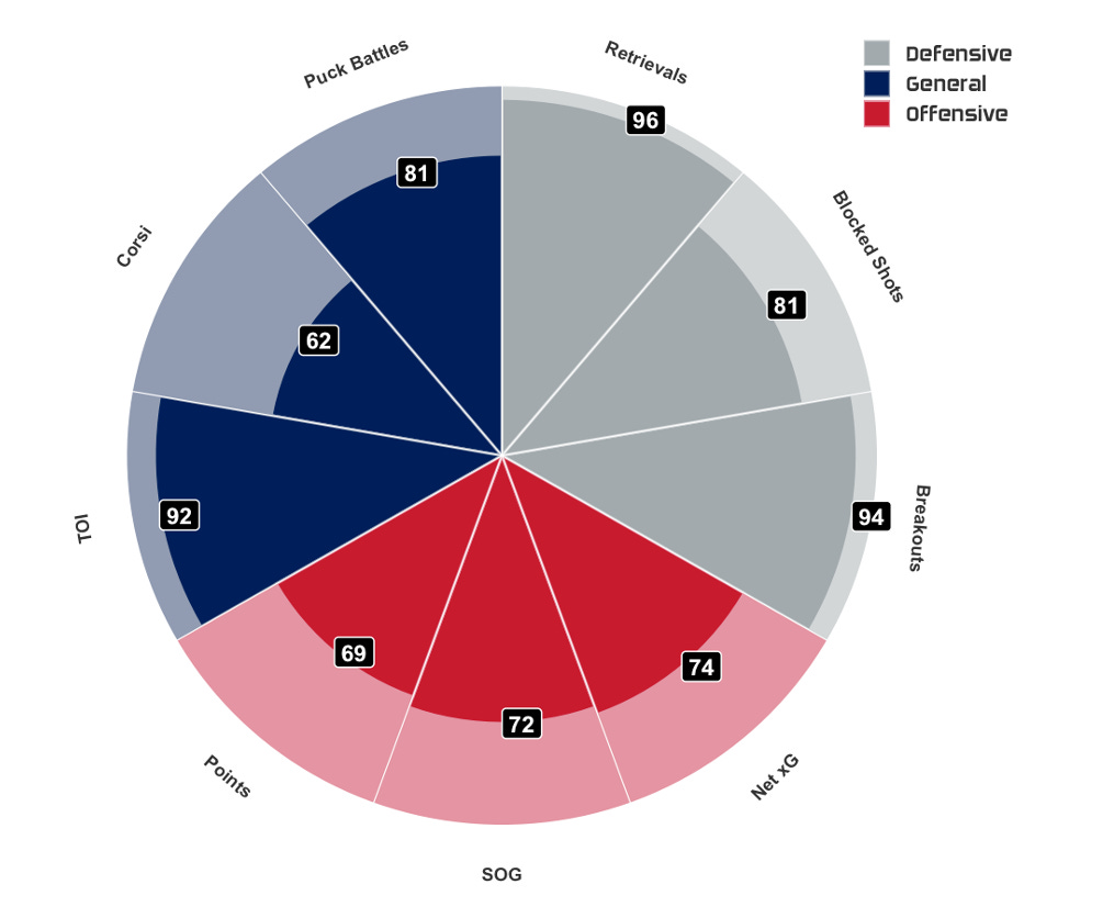
In the world of data science, one of the most useful tools is visualization. In the world of hockey analytics, this remains the same. In sports, you need to be able to break down complex information into a medium that the regular person can understand. This may be using subtitles, colours, or lines to name a few. Today, we will look at a cool design known as a polar chart. There are a ton of different ways to design these but I take my design inspiration from Dom Samangy who is one of if not the top sports analytics resources. Let’s dive in.
Process
So how does this work? Well, what I did was I took all data from the 2023/2024 regular season and placed all of the stats into percentiles. For this, we had 100 being best in the league, 50 being average, and 0 being worst in the league. This ranking system allows us to compare players across various metrics, making it easier to identify standout performances and areas for improvement. By visualizing stats as percentiles, we can quickly assess how a player measures up against the rest of the league, providing insights that might be overlooked in raw data. Ultimately, this approach gives us a clear snapshot of a player's performance and helps guide further analysis.
Options
The fun thing about having publicly available data is we can use just about anything we want and we can make it just about as complex as we want. In this case, if you wanted to look at things strictly from an offensive perspective you could change out the legend to be playmaking, scoring, and overall offense. You can take it in any direction you desire.
Usage
So how can we use this visual? As I mentioned, the sky’s the limit. In the case of the polar chart here today, this gives analysts and coaches a small glimpse into what a player is about from a simple but wider perspective. Is he good at generating offense? Can he hold his own in the defensive zone? How is his usage and is he winning those minutes played from not only a shot but a quality point of view?
Wrap Up
By utilizing tools like the polar chart, we make it easier to enhance our understanding of player performance in a visually engaging way. This not only aids in the evaluation of current players but also could inform scouting and recruitment strategies, ultimately contributing to more data-driven decision-making in the sport. While these stats shown in the visual are important and can be changed based on preference, it is even more important to get an even deeper understanding. For example, I heavily use these visual types in my player development reports but I dive incredibly deeper into each stat such as looking at the entry locations, seeing how the player uses his body in battle situations, analyzing retrieval routes and quick passes. Ultimately, combining these detailed analyses with visual tools creates a holistic approach to player evaluation. This ensures that we not only identify trends but also understand the context behind them, leading to more informed and effective decision-making in the world of hockey analytics.


love this, getting started in hockey advanced analytics and trying to get my friends more into hockey, what do you suggest for a team based version of this (to get a general understanding of the league)