


Over the past season I was lucky enough to attend a PWHL game. The atmosphere was so unique, from the music to the intermission entertainment to the crowd. As a longtime fan, you spot differences between that and an NHL game. The PWHL presentation team does a great job catering to its audience. The numbers back that up:
77% YouTube Viewership Growth: Live streaming viewership on YouTube jumped by 77% season-over-season, fueled by fans tuning in from 154 countries worldwide (up from 106 the previous year).
1,116,497 Regular-Season Attendance: The league shattered records by surpassing 1 million single-season attendees for the first time, drawing over 1.1 million fans across 120 regular-season games.
9,304 Fans Per Game: Average attendance per game rose to 9,304—marking a 28% increase over the previous campaign (including playoffs) and a staggering 71% jump from the league’s inaugural season.
18,006 Peak U.S. Attendance Record: The league set a new U.S. record for professional women’s ice hockey when a sold-out crowd of 18,006 fans packed Madison Square Garden for a matchup between the New York Sirens and Seattle Torrent.
190% Post-Olympic Merchandise Surge: Following the Milano Cortina Winter Games, online merchandise sales experienced a 190% increase compared to the same period the prior year, alongside in-arena gear sales doubling overall.
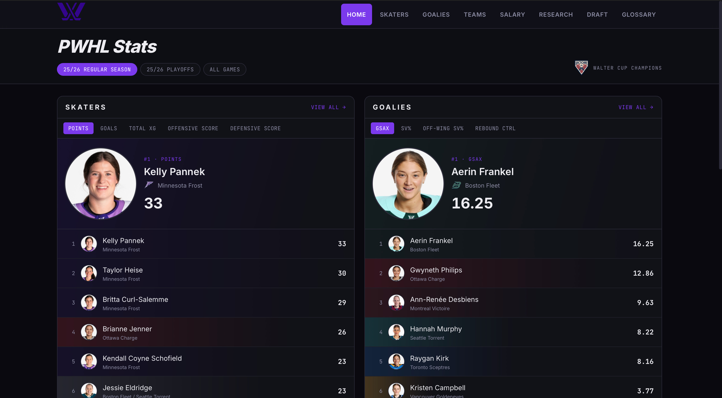
It’s only fitting that as the viewership grows, so does the accessibility of data. I set out to build something that I hope does the league justice when it comes to publicly available analytics.
The Data
Surprisingly enough, the easiest task when building out the site was getting the data to do so. I’m fortunate to have access to one of the top proprietary firms when it comes to data from every league, but the issue there is they don’t actually have half of the metrics I’ve built. This is where logic and engineering come in. I had a huge file of over 1,000 events per game but how do I get the metrics that matter? I had to think realistically: in this play-by-play file, how do we identify a retrieval that was successful? Well, we have the breakout that occurred post-retrieval, the result of that entry, the location, and the player. From that, we can accurately say that when X occurs after Y action, that was a successful retrieval. One of the most exciting aspects of all this was combining source pages of data. I had about 10 different tabs that I had to go in and create custom extractions for somehow and then merge them all into one. One of the most time-consuming aspects of it but in the end 1000% worth it.
xG Model Architecture
I started with 7,249 shots from PWHL InStat play-by-play data, including 602 goals. For every shot, I looked at both where the shot came from and how the chance was created. Distance and angle to the net form the foundation, but the model also considers things like rebounds, rushes, cycle/forecheck possessions, tips, goalie movement, power plays, and other details surrounding the shot. The idea behind xG is actually pretty simple: if this exact type of chance happened 100 times, how many would we expect to become goals? A shot worth 0.25 xG is essentially saying we’d expect that type of chance to become a goal roughly 25% of the time.
I used logistic regression to turn all of those factors into a goal probability. The model was then tested using five separate validation samples, achieving an AUC of 0.944. In simple terms, the model does a very good job distinguishing dangerous chances from low-quality shots.
After accounting for location, shots following sustained cycle or forecheck pressure received one of the largest boosts in the model, while rebounds and uncontrolled rebounds were also extremely dangerous. One of the most interesting but logical findings to me was when a goalie is moving rather than set, the probability of a goal increases.
That’s ultimately what I wanted the model to capture. Not just where a shot happened, but what was happening around it. Two shots can come from almost exactly the same location while being completely different chances, and I wanted the model to recognize that.
Features
Once the underlying data was built, the next step was figuring out which metrics were actually worth presenting. I wanted the site to go beyond traditional box-score statistics and show how players and teams were creating results.
Some of my favourite metrics include:
Neutral Zone Risk
Neutral zone risk looks at how often a player puts their team in difficult situations when attempting to move the puck through the middle of the ice. Rather than simply counting turnovers, the goal was to add context to where those turnovers occurred and what happened afterward.
Entry Methods
Not all zone entries are created equally. This breaks down how players enter the offensive zone, whether that is through controlled carries, passes, dumps, or other methods. It gives a better picture of a player’s tendencies and how they prefer to attack the offensive zone.
Breakout Efficiency by Lane
Breakouts are another area where traditional statistics don’t tell the full story. This metric looks at how efficiently teams and players move the puck out of their defensive zone through different lanes, helping identify which options are actually producing successful exits.
These are just a few examples of the metrics available throughout the site. The larger goal was to build statistics that provide context rather than simply adding more numbers to a page.
Draft
With the draft occurring in the last few months, it felt fitting to include profiles on the draftees. All the profiles are the exact same as the individual players just with some different design work as well as needing to build my own API for all logos. It took some time but for the present and future it will certainly pay off since I was able to put it into one central API rather than finding random APIs for SDHL logos or other non-traditional leagues in the future. The biggest challenge was certainly teaching the system how to sift through NCAA data versus all the international tournaments the athletes play in. Overall, I’m happy with how it turned out. I plan to make some UI adjustments in the future but for now we have a strong baseline to build on.
PWHLe
The PWHL Equivalency projection tool works similarly to the traditional NHLe models you might be familiar with from the men’s game, but it is built specifically around the landscape of women’s hockey. Comparing a 40-point NCAA scorer to a 40-point player in Sweden’s SDHL isn’t as simple as looking at the box score. The leagues have different levels of competition, different scoring environments, and different levels of scoring compression, so the same number of points can mean very different things. The PWHLe tool attempts to account for that by calculating translation factors based on how players from different leagues have historically transitioned into the PWHL.
The differences are pretty significant. Historically, Sweden’s SDHL sits at the top of the model’s translation hierarchy, with a translation factor of .78, while Finland’s Liiga comes in at 0.74. NCAA D1 sits at 0.62, meaning a player’s college scoring is expected to decrease by roughly 38% when moving to the PWHL, while U SPORTS sits at 0.55. In other words, a point is not necessarily a point when you’re comparing players across leagues.
One of the more interesting parts of the model is that it doesn’t simply treat every player coming out of the same league identically. There is a reward for proving that you can move up. If a player goes from a weaker league into a stronger professional league, continues to produce, and then enters the PWHL, the model gives them a 4% to 15% boost to their most recent season’s translation. That matters because there is a big difference between dominating college hockey and proving that you can produce after already making the jump to a professional environment. The model is essentially saying: we’ve seen this player take a step up before, and they proved they belonged.
From there, the tool goes beyond simply projecting points. Players are also categorized into archetypes based on the balance of their offensive and defensive profiles. A forward with an elite scoring history can be classified as an Elite Finisher, while strong assist production and offensive scores can identify a Playmaker. Players with balanced offensive and defensive profiles fall into the Two-Way category, while players who don’t show significant production on either side are classified as Depth. Defensemen are treated differently, with the model distinguishing between Transition Defensemen, who show a strong offensive profile and the ability to drive play, and Shutdown Defensemen, whose defensive impact outweighs their offensive production.
The really interesting part is what happens next. The model doesn’t stop at predicting how many points a player might score. It uses that projected scoring rate to estimate what their game could actually look like on the ice. A forward’s expected points-per-game is used to estimate things like high-danger chances and zone entries. For example, a forward projected for 0.70 points per game would be expected to generate roughly 0.46 high-danger chances per game, while also being projected for around 4.2 zone entries per game. Higher-scoring forwards are expected to carry the puck more frequently rather than simply dumping it in and hoping for the best.
The model also recognizes that defensemen create offense differently. A high-end Transition D isn’t expected to produce in exactly the same way as a scoring forward. Instead, their offensive value is more closely tied to things like puck retrievals, transition play, and their ability to turn defensive possessions into offensive opportunities.
Ultimately, that’s what makes the PWHLe tool more interesting than simply taking a player’s points and multiplying them by a number. It tries to answer a much bigger question: if this player were playing in the PWHL right now, what would their game actually look like? It isn’t a crystal ball, and no model can perfectly account for things like defensive impact, physical development, role, or how a player adapts to a new level of competition. But it provides a common language for comparing players coming from completely different hockey environments—and gives us a much better starting point when trying to figure out who might be ready to make the jump to the PWHL.
Check it out here: https://project-u21dk.vercel.app